How To Create The Ultimate Impact Report (with samples)
- Mar 21, 2019
- 5 min read
Updated: Aug 10, 2023
Before we dive into this week’s post, can we take a moment to applaud the DRG community? A few weeks ago, we asked you to share examples of your stewardship and impact communications for our 2019 Stewardship Report Swap, and friends you did not disappoint. Thank you for participating and helping us create this incredible resource!
Collectively, you shared more than 1,800 pages of samples. No, that’s not a typo. We’re talking about nearly 2,000 pages of ideas and inspiration filled with swoon-worthy designs, donor-focused language, and powerful stories of impact. So, before you continue reading take a moment to give yourself a high-five, pat on the back, and a round of applause because you rock!
While there are dozens of samples worthy of praise in this year’s collection, we’ve chosen just a few of our favorites to showcase here. Check them out below and read on as we share our top tips for creating the ultimate impact report.
Abilene Christian University Endowment Report - The infographics, images and student quotes are wonderful!


Biola University – This is a simple communication with a powerful statistic. We love the line that says donors subsidized tuition by $3,500 per student. It also has quotes from students, which is always a nice touch.

Colorado State University - Their endowment report has this lovely reflections page that shared some great data from the past year. We really like this tactic.

Emory University – Their impact report to the Marcus Foundation was awesome! From birth to old age - very clever and compelling.


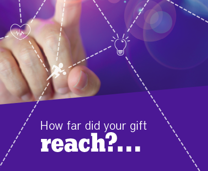
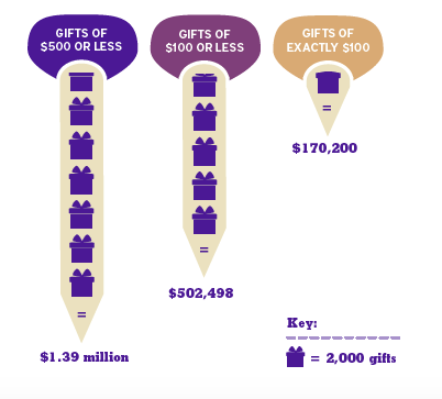
James Madison's Annual Giving Impact Report – We love the outside envelope image with the question, "How many lives did you touch?" And the inside cover of the report asks "How far did your gift reach?" Compelling and interesting design with beautiful images and infographics made this one of our favorites.


Portland State University – We love the vibrant design and combination of imagery, color, and graphics in this piece.


The University of Notre Dame did something clever - they created a calendar for 2018 and featured a donor story and statistics about giving on each month. We love this idea so much we may implement something similar into our work.


University of Alberta - This donor impact report is especially fabulous. We love the design and the powerful, tight copy. They also have an equally impressive and interactive digital version of their report here.


University of Wisconsin's Annual Giving Impact Report is great - fresh design and clever copy. We are big fans of the “You” statements in this piece.


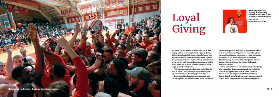
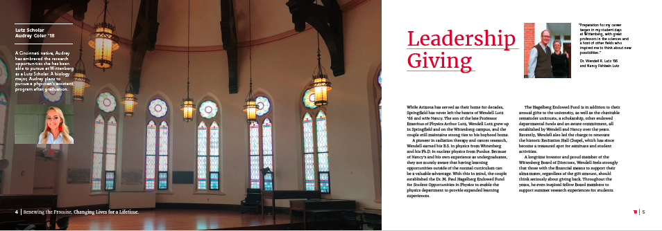
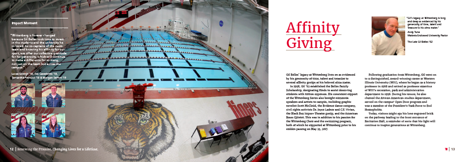
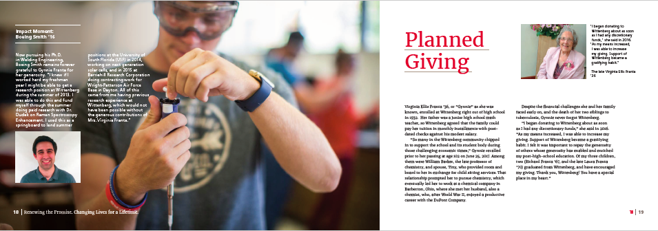
Wittenberg University – We love their philanthropy report - they broke it down by types of giving: leadership giving, young alumni giving, loyal giving, student giving, faculty giving, planned giving, athletic giving - and had a story for each type. What a great way to promote all levels and types of giving! The infographics were also really great, and they did some wonderful cards that said "Your Impact in Action" on one side with a student profile on the other. SWOON!


Birthright Israel – This short, easy to digest report has a bright and modern design, wonderful stories, and beautiful infographics.


Michigan Humane Society – We love the design and the use of infographics in this report. Plus, how could we not love something filled with photos of puppies and kittens?


Opportunity Enterprises – This “Because of you” postcard series is a wonderful way to periodically share impact and gratitude with donors, and the storytelling here is fabulous!


United Way of Greater Philadelphia and Southern New Jersey – Gorgeous design with brilliant use of infographics to break up content. We also love “Thank you for being extraordinary” so much more than “Thank you for your gift.”


You can find all of these examples in their entirety, as well as hundreds of others in the DRG 2019 Stewardship Swap.
So, how can you create an impact report that will surprise and delight your donors? The ultimate stewardship report should display each of the following characteristics:
It demonstrates impact, period. We’re stating the obvious here, but as you start this project remind yourself of the purpose behind it and stay hyper-focused on that. Now is not the time to tell them about new programs, funding opportunities, or your calendar of events.
It’s donor-focused. Don’t tell the donor what your organization has done; tell them what their generosity has made possible. Make them feel like the hero. Challenge yourself to use “you” instead of “we” as often as possible.
·It’s beautifully designed. Gorgeous, high-quality images, infographics, thoughtful use of coIor, easy-to-read fonts…a fabulous design can go a long way in taking your impact report to the next level. Hire a photographer or use a copyright free photo library (we like Pixabay) for stock images. Work with a graphic designer. Choose your favorite samples from this swap and be specific about what you’re looking for. If you don’t have a designer on staff, hire a freelancer. Our favorite is Tyler at Wessel Creative, but you can find others on platforms like Upwork. If you have a knack for graphic design, you can also try using Adobe Spark to create something more attractive than a Word document without breaking the bank.
It tells powerful stories. Sharing stories about how a donor’s gift has changed someone’s life is one of the most effective methods of demonstrating impact and making donors feel like the rainbow unicorn kittens they are. We like to use the Pixar Pitch method when developing our stories.
It oozes gratitude. Your report should begin and end with a heartfelt message of thanks. And don’t thank them for their donation, thank them for their generosity. Thank them for changing lives. Thank them for their commitment to your mission. See where we’re going here? It isn’t about the money. It’s all about the incredible, generous souls who invest in changing the lives of others. That’s powerful, and it deserves all the gratitude.
It provides a clear explanation of how the funds were used. If your donors don’t see that their generosity is being put to good use, they won’t give again. Plain and simple. It’s our job to ensure they know not only that they have made an impact, but how.
The donor’s name is spelled correctly. On the envelope, within the report, in the email…anywhere the donor’s name is listed. While you’re at it, make sure you’re addressing them appropriately as well. More on that here and here.
It does not contain an ask in any way, shape, or form. There’s nothing worse than, “Thank you, but can we have some more?” It’s rude, it’s off-putting, and it’s one of the worst donor relations practices we’ve come across. Please…no thasking!
What we love the most about these swaps is that everyone can learn something. Whether you’re the most advanced shop or you’re just getting started, there is something within these 1,800 pages that will spark your creativity, make your rethink the status quo, or inspire you to create a better experience for your donors. And that is what we’re all here for.
We can’t create resources like this without your help, so from all of us at the DRG Group, thank you for joining this community of change makers and sharing your incredible work with all of us.
Cheers,
The DRG Group
This post was written by DRG Group Director of Marketing, Ashley Rowe.


